- Home
- Sample Resumes
- Best Font for Resume
The Best Font For Resume - style and size
What is the best font for resume and most importantly, for your specific resume? We look at the best font types for resumes and how to select the right one for you.
Your resume will have about 7 seconds to make the right impression and convince the hiring manager or recruiter to continue reading. Your resume font should be appealing, easy to quickly scan and accessible. The wrong font could see your resume get passed by.

Serif and Sans Serif Font Styles - what's the difference?
Every font belongs to a family of fonts - the 2 main being serif font and sans serif font.
Serif fonts have little "tails" or lines, called serifs, at the end of each stroke in a letter. Sans serif fonts do not have these little decorative tails and are made up of clean, simple lines that are the same throughout.

Serif fonts are more traditional and help convey a formal and serious message. Some consider these fonts as being easier to read as the little tails on each letter can help you to compute what you're reading a little bit faster.
Sans serif fonts are considered more modern and contemporary-looking, providing your resume with a fresher look. They are generally less formal than serif fonts and provide a minimal and simplistic look.
The 10 best fonts for resumes fall into both serif and sans serif categories. When selecting the right resume font the main criteria are legibility and accessibility.
The reader experience is all important - your resume should be easy to read to survive the seven-second scan. Further considerations when selecting the best font for resume are :
- whether your resume is going to be read in a print version, on a computer screen or on a mobile device - certain fonts read better on different devices or in print.
- the industry you are in and the type of job you are applying for - different professions may be best reflected by different resume fonts.
The top 10 best font types for resumes are listed with the advantages for each style clearly and concisely outlined. Find the most appropriate font for your resume from the many font styles on offer.
Top 10 Best Fonts for Resumes

Calibri, a sans serif font, replaced Times New Roman as the Microsoft Office default font which makes it familar to the eye.
Why it's a good choice:
- professional- looking
- easily readable
- renders correctly and well on computer screens when your resume is opened
- its tight layout means it works in a range of text sizes and helps keep your resume to a manageable length
- modern, clean and simple
- described as a warm and gentle font by its designer, Lucas de Groot
Calibri works well for most resumes and particularly for jobs in:
- nursing and care-related professions
- teaching
- social work and other support-type jobs
- engineering and jobs that have a lot of technical detail as it is functional and familiar and allows more text on the page while still looking clean.
Consider:
Calibri may be a little too safe and familiar for highly creative jobs or for a more quirky company.

Cambria is a serif font and was designed by Microsoft for easy on-screen reading and to look good when printed at small sizes.
Why it's a good choice:
- performs well on computer monitors and for on-screen reading including smaller screens
- the sturdy letter construction means it is easy to read in smaller text sizes
- designed to be easy to read when printed out
- slightly less formal and considered more "friendly" than other serif fonts such as Times New Roman
Cambria works well for jobs in:
- management
- finance and accounting
- law
- academia
- banking
Consider:
Although considered less formal than some serif fonts it is still a traditional font and may not be the best font for a resume and job applications in more contemporary and unconventional industries.

Georgia is another serif font that is recommended for its easy on-screen reading and is available on almost all computers.
Why it's a good choice:
- it has the classic serif elements but also contains contemporary elements
- clean and crisp looking
- created for clarity on computer screens and reads well even on low resolution screens and a variety of screen sizes including mobile devices
- considered a little more "fun" than other traditional fonts
- allows you to create a resume look that is professional and elegant but also trendy
Georgia works well for jobs in:
- writing, blogging and editing
- publishing
- marketing
Consider:
Georgia's strokes are a little thicker than other fonts and so it may not be the best font for a resume if you are struggling to keep your resume to a certain size.

Verdana was created for Microsoft as the sans serif sister to Georgia. The font was designed so that it is easy to read in small print on screens.
Why it's a good choice:
- a clean and modern font, it's easy to read because of its wider spacing
- renders well on a small screen such as a mobile device

Helvetica font is a modern, sans serif favorite considered by many to be the king of fonts! However, it only comes preloaded on Apple computers so you have to purchase it if you don't use a Mac. Arial is a good alternative as it very closely resembles Helvetica. Arial is the default font for Google Docs and a standard font for MS Word and will display correctly on most computers.
Why it's a good choice:
- modern and clean lines
- clear, simple and easy to read
- renders well on computer screens
Arial is a safe choice for most resumes and particularly for :
- sales jobs
- administrative jobs
Consider:
It is one of the most used fonts and its generic quality may be considered too bland for jobs in creative industries or trendy companies.

A good sans serif alternative to Arial, Trebuchet renders well on screens and is not as over-used.
Why it's a good choice:
- a friendly and rounded font with a modern look
- described by Microsoft as having "energy and personality"
- easy to read
- designed for use on screens and renders well on smaller screens such as mobiles
- works well at both header and body copy sizes
Trebuchet is a good resume font choice for jobs in:
- marketing
- fashion
- media
- entry level jobs where its wider body helps fill up the resume page and its style conveys enthusiasm and energy
Consider:
It is a wider font than Calibri and others and may not be suitable if you are struggling to manage the length of your resume and need a tighter layout.

Tahoma is another san serif font that has a more modern look.
Why it's a good choice:
- professional yet a contemporary and trendy style
- strong lines make for easy reading
- renders well on screen
- narrow body and tighter spacing allows for more text on a resume page without losing readability
Tahoma is a good resume font choice for technology-focused jobs as it is works well with detail-heavy resume copy.
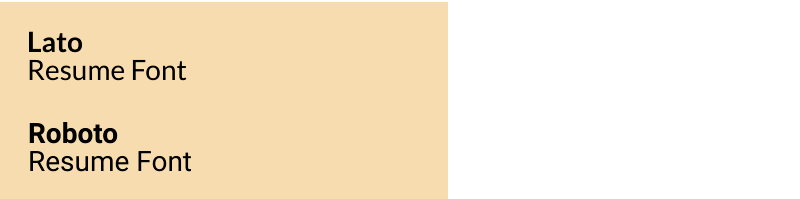
Lato and Roboto are two sans serif fonts that are not resume classics but are worth exploring as more modern and less-used resume fonts.
Lato and Roboto have the following advantages:
- professional and serious looking but the semi-rounded details convey warmth and a friendly feel
- easy to read and approachable
- not as over-used as some of the more common fonts
- different enough to stand out but sufficiently corporate to still be professional
Consider:
Lato and Roboto won't be installed on all computers and your resume might not show up properly as a Word file. If you use these fonts make sure you send your resume to PDF format.

A traditional font that may be considered outdated and over-used but still works as a classic and professional resume font. It is a safe and formal font that conveys seriousness.
Times New Roman is best used for jobs in more traditional and conservative industries.
Consider:
Times New Roman does not display as well on small screens .
Fonts to Avoid
The main consideration in selecting the best font for resume is that it is easily scanned and read.
Some resume fonts are a definite no, and recruiters and hiring manager are unanimous in describing the resume fonts to avoid.
- thin or light fonts can be difficult to read on screen
- fonts that look like handwriting such as Brushscript or Segoe are difficult to quickly scan and read and look unprofessional
- "funky" fonts like Comic Sans look childish and distract from the serious content of a resume
- heavy and bold fonts like Impact are almost impossible to read quickly and accurately and are not recommended even for headings
- font types that mimic type-written letters such as Lucida Console are considered inappropriate and your resume will not be taken seriously

Best Font Size for Resumes
What size should your resume font be?
- the regular font size for resumes is 12 points - this is easy to scan and read in different formats.
- if you are having difficulty keeping your resume to a manageable length (1 to 2 pages for most job applications) you can try making your font 11 points or even 10.5 points. Depending on the resume font style, this should still be sufficiently legible
- if your resume exceeds the maximum length by just a few
words or sentences try editing your resume by using synonyms, rewriting sentences and removing unnecessary words to make it
shorter rather than using a too-small font size (usually anything less than 10.5 pts)
- avoid increasing your font size to over 12 just to fill up empty space on your resume page.
- larger font sizes are acceptable for headings or subheadings.
To achieve the right balance between resume length and legibility, select a font type and adjust the size to allow the reader to scan your resume quickly and enjoy a good reader experience.
Best Font for Resume - getting past the ATS
Many employers use Applicant Tracking System (ATS) software to record and sort resumes and job applications. These ATS programs do not read certain font types well and using them puts your resume at high risk of being ignored.
Avoid intricate and unusual fonts and stick to the tried and tested resume fonts including those listed in our top 10 above.
The best font for a resume is one that is widely used and will keep your resume as
intact as possible as it gets processed through an ATS, and circulated
among recruiters and hiring managers on different computers.
Find out everything you need to know about how to create a resume that gets past the ATS.
Best Font for Resume 2023
Consider the 3 main selection criteria when deciding on the best font for a resume today.
- easy to scan and read
- how is your resume going to be read - print, laptop, desktop or mobile
- the position and industry for which you're applying
Certain resume fonts are considered more contemporary and modern-looking including Calibri, Georgia, Verdana and Tahoma. They work well on screens and are less formal than some of the more traditional fonts like Times New Roman.
The modern resume fonts work well in our digital world and in less formal professions and industries. Traditional fonts may be considered more appropriate for conservative professions and industries that expect a high degree of formality.
If the job opportunity is in a creative field than it is acceptable to go with a more unconventional font. However it still needs to be easy to read and render well on screen.
Everyone viewing your resume on a computer will have different fonts installed so it is important to use a universal font that most computers have today. You don’t want your resume font automatically replaced with a substitute that compromises your resume's appearance, readability and formatting.

Standard Font Style for Resume and how to use fonts in your resume
The most common standard font styles for resumes are Arial, Helvetica and Times New Roman. However as long as you use a professional, widely accepted and easy-to-read font you will be safe.
There are some basic rules for how to use resume fonts:
- differentiate your headings and section titles from your body copy by tastefully increasing the font size, using bold or using a well matched second font type
- avoid using more than 2 font types in your resume. If you pair fonts, one for heading and one for text, make sure they both are easy to scan and read and do not detract from each other
- avoid multi-colored fonts - it is safe to stick to black text to optimize your resume for readability
- ensure your resume is accessible and easily scanned by including sufficient white space
- use your resume font consistently throughout your resume in terms of size, spacing and headings
- use the same font on your cover letter to keep your application consistent
Over 50 Top Sample Resumes
Everything you need to create a job-winning resume. Sample resumes, resume building tools and resume templates.


How to write an impressive resume objective
How to Write a Winning Resume Objective
What is the best font for a cover letter ?

How to write a convincing cover letter
Including a powerful cover letter with your resume greatly increases your chance of job search success. Select the cover letter you need.

